
CSS
What is it?
Cascading Stylesheets. It's what adds the style to HTML. By using a consistent stylesheet, you can apply styles across multiple HTML pages on an entire website.
Why should I learn it?
CSS goes hand-in-hand with HTML. It allows you to be very flexible with modifying and customizing design elements and provides methods for making your sites responsive to different screen sizes and formats.
What can I do with it?
You can apply it to a web page/site you have already made and change things like color, typeface and layout. You can also use it to customize sites you create from content management systems, like Wordpress, or development frameworks, like Bootstrap.
How long will it take?
You can start applying CSS immediately to the HTML page you created in the previous exercise. As you work with it, you will learn tips and techniques that will help you create interesting designs. But you should be able to pick up the basics in a few hours.
Getting Started
CSS (Cascading Stylesheets) is a language that lets you apply style to your HTML pages. You can add color, change typefaces, adjust sizes and control layout. You can even use CSS techniques to make your sites responsive to different screen formats, like tablets and phones. This will be covered in the Responsive Design tutorial.
Like HTML, CSS can be developed in a simple text editor like TextEdit, BBEdit or Notepad. Or you can use an HTML editor like Visual Studio Code, Atom, Sublime Text, Komodo Edit or Notepad++.
You can apply CSS in three different ways:
Within an element: add the style attribute to any element. This style only applies to the element on which it is placed.
The above controls the color of the text of that particular paragraph.
In the head of a web page: you can include styles in the head section of your web page. These styles only apply to elements on the page on which they are placed.
The above controls the color of the text of all paragraphs on the page.
As a separate stylesheet linked to multiple pages: this is the preferred method. You create a separate file that includes all your styles and then you link that page in your html file.
You will place the above code in the head of your html page. You can name the file anything you want, as long as you give it a .css extension. Be sure to use the proper relative path to the file, depending on where you save it. As with all Web development files, it is important to establish an organized file structure to start. You should pay attention to the relationship between files when creating links and inserting images.
CSS3 is the current generation of CSS. It adds some cool functionality like rounded corners, gradients and animated transitions, which we will cover after the basics.
A property is a command written between curly braces that is applied to an html element. Each property contains a value, assigned after a colon. End each property line with a semicolon.
The above style assigns a blue color and italic style to the h1 element. You can apply as many properties as you need to the associated element. The properties have associated values deemed by the designer.
Make sure you close the curly brace and the semicolon. Inconsistent coding can cause errors and problems that will take time to troubleshoot. Like HTML, CSS properties should be lower-cased. It is considered consistent coding style to use lowercase for css properties and is the standard the most Web developers now use.
Basic Properties
Basic Properties
There are several basic properties that you will use in your stylesheet.
- Font properties
- Color and Background properties
- Text properties
- Box properties
- Border properties
- List properties
- Other properties
- Positioning
font-family - use to indicate a specific use of a typeface. User must still have the font on their device, but by including a list of typefaces, you can increase the chance of them having one of your desired fonts. For example: font-family: Arial, Verdana, Helvetica, sans-serif.
font-size – typically em (a relative size) or px (pixel sized)
font-weight - bold
font-style – italic
color – color of text; can use color name or hexidecimal code
background – color of background
background-image –background-image: url(“name.gif”);
background-repeat – use 'no-repeat' to show once; background-repeat: no-repeat;
text-decoration – underline
vertical-align - vertical positioning of the element
text-align – alignment within element
text-indent – first line indent
margin-top, margin-right, margin-bottom, margin-left
shorthand example - margin: 1px 1px 1px 1px; Read these clockwise starting with top
padding-top, padding-right, padding-bottom, padding-left
shorthand example: padding: 1px 1px 1px 1px; Read these clockwise starting with top
border-top,border-right, border-bottom, border-right
border-width - establish size of border
shorthand example border-width: 1px 1px 1px 1px; Read these clockwise starting with top
border-color
border-style – dotted, dashed, solid, none;
shorthand example: border: 2px solid red; This creates the same border size, style and color for all borders
list-style-type - disc, bullet, none
display: inline (to make lists present horizontally)
width - can be pixel or percent; percent used for responsive design
height - can be pixel or percent
display - inline or block to change default; use flex for positioning divs next to one another
position – absolute or relative
top – use with absolute positioning
left- use with absolute positioning
Use divs as containers for layout
Can use absolute or relative positioning
Can size containers with pixel or percent, but we will cover percentages in more detail when we discuss responsive design. See below for more on layout.
Format of a CSS file
Copy and paste all the code in the Code Sample - CSS to the right into a text editor like Text Wrangler (Mac) or Notepad++ (PC). All css files should have the .css extension. For this file, name it style.css and save it in the same folder as the html page you created in the previous exercise. For consistency and easy troubleshooting, filenames should be lowercase with no spaces.
In the index.html page, insert the Sample Code - HTML into the head of your document. You will need to do this in all your html pages for the styles to apply to those pages. Open index.html that you created in a browser (File, Open File). You should see the file render with the new styles associated. .
Play with the styles. Change colors and other attributes to see how they affect the page.
Code Sample - Basic Elements
CSS
HTML
Your page should look something like this when you open it in a browser.
Classes and IDs
Classes
The above styles aren't the only ones you can create. Sometimes you need to use the same style across different elements of your site. For this, you can create a special class. Use the format below, preceding your class with a period (.). You can create as many special classes as you need, and you can use a class as many times as you want on a page.
The code above will create a style called "small" that you can use anytime you want smaller, italic text on the site. You can add any other properties you want to this style. To apply the style to an element in the html page, use the syntax below.
You can create classes that can be applied to any element or you can create classes for specific elements. For example, you can make a special class that applies only when used for paragraphs.
IDs
Sometimes you want to set up a style that will only be used on one element on a page. This is particularly helpful for using styles to layout a page. You will use in conjunction with the html elements for layout (see below), to create interesting and responsive layouts. Use the pound sign or hashtag (#) before the style to indicate an id.
Then include the id in the element on the page. IDs can be used with any element, but they are often used with the generic container elements
In applying responsive design, we want to use percentages for our widths, as you will see in the examples below. More on that in our next exercise on Responsive Design.
Just as we did with classes, we can create ids that can be applied to any element or you can create ids for specific elements. For example, you can make a special id that applies only when used for divs. This way, the #header id cannot be used with any element other than div.
Code Sample - Classes and IDs
Add the styles below to the bottom of you css file and then add a paragraph that references the small class to the bottom of the html page. Do this before the closing body element.Add a div element with an id of "header" to the top of the page around your h1.
Make sure you save both files. Refresh the index.html file in the browser. Refresh the page every time you make a change.
CSS
HTML
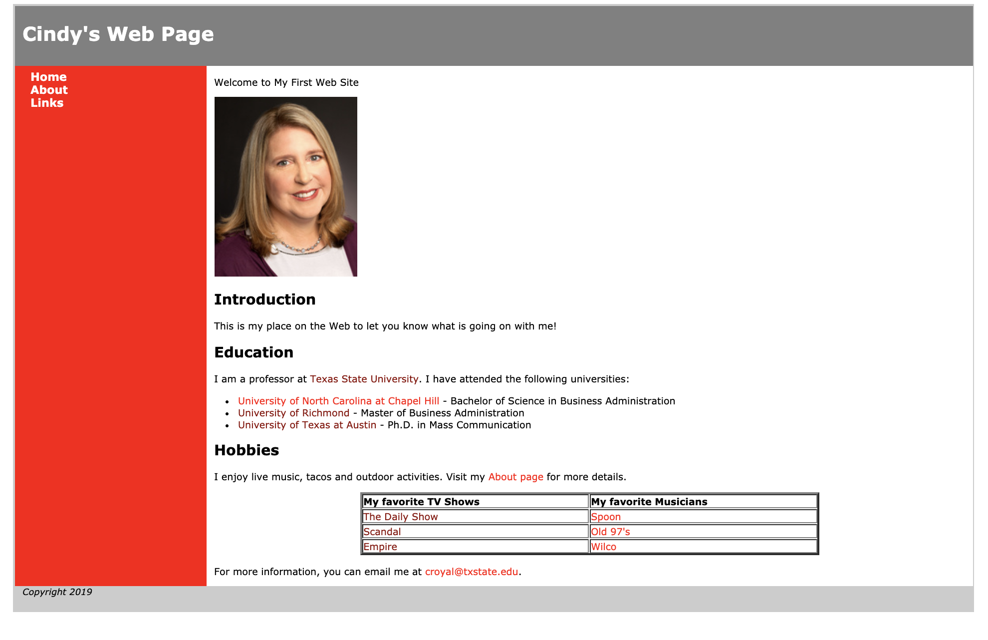
Notice how a box was created around your header section and the last paragraph with the copyright information is much smaller than the other paragraphs.
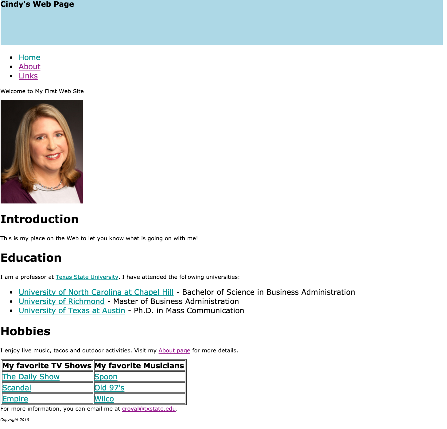
Notice how this code creates a box with the dimensions and styling indicated by the header id and applies it to that div element in the page. You can add a logo here and do other styling to the elements within the header to create the introductory segment of the page. Next we'll use divs with ids to create an entire page layout.
Using CSS for Layout
As we introduced above, there are generic html elements that allow you to structure a page and add styles.
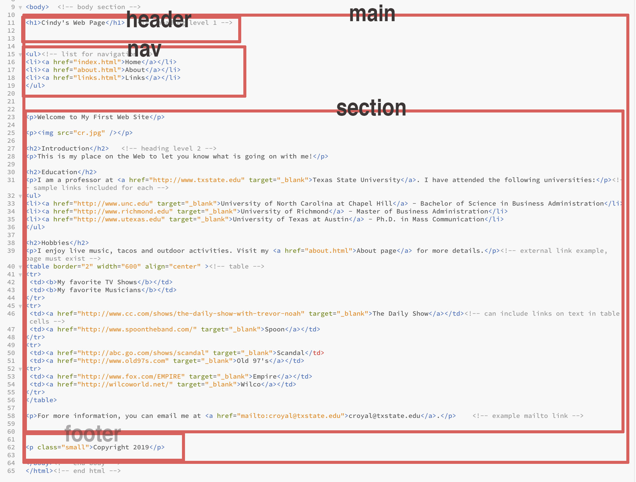
You will make some changes in your html page to apply the divs you will need to begin to add structure. We'll apply ids for header, nav (for the navigation bar), section (for the content and footer. Making a "main" div that contains all the content on the page, with a margin "auto", centers the page in the window. We use percent widths for our divs to begin applying techniques that allow the site to be responsive to different sized devices.The image below shows the plan for creating the divs to create the site layout grid.
Use the code to the right to apply div containers to the content on your page. Make sure all content on the page is included in a div, so it will be in a layout container. See the code sample on the right.
Notice that the nav property has styles to control the way the lists and links look for that property only. This allows us to structure the navigation section of the page in a way that is unique to the default list and link styles.
Once you apply these basic styles to your page, you will notice some things that need to be adjusted. This is the process of web development. You apply changes, notice things you want to improve and then figure out the proper techniques to fix them.
- White space in header div above h1 and nav above ul. Some elements have a default margin, so give a "margin-top: 0" style to each of those elements to remove this space; apply a padding-top to put space between the heading and the border in the header.
- Apply padding to the nav ul to improve spacing.
- Apply margin-left to other elements on the page to improve presentation. Can apply a style to multiple elements as such:
Code Sample - Layout
CSS
Remove the style for #header we created above. Add the properties below to your stylesheet. These styles are a little more complex than what you added above, but go through them carefully to understand what they are meant to do.
HTML
Now create the divs on the html page to correspond to what is in the stylesheet. Make sure all content goes in a div. The code below includes html comments to indicate where the divs begin and end, but this code does not affect how the page looks. It just makes it easier to be sure you have closed all divs that have been opened. Paying attention to closing divs will become more important as we have nested divs in more complex layouts.
Your page should be starting to look like it has some layout applied to it. You will have to add the divs to all your pages, but you can just modify the first page as a template and res-save them, if you'd like.
Another Stylesheet
Just for fun, let's apply another stylesheet that uses the same divs but creates a completely different layout. Find the code to the right and create a new stylesheet with these styles. Let's name it style2.css.
Using Flexbox
This stylesheet gives us the ability to have a side, vertical navigation bar that goes next to the section div instead of above it.
This technique employs Flexbox, which replaces the old way of using "floats" to position containers next to each other. A parent div named "row" is created that contains the nav and the section divs. That is given a style of display: flex. Child elements within that parent will be positioned next to one another, in this case, based on the percentage widths specified. You can achieve more complicated layouts with Flexbox, but this provides its most basic application.
You could use this same technique to include a sidebar on the page. Play around with css until you get the layout grid you want for your site.
This demonstrates the power of CSS. By making changes to CSS, you can accomplish a broad design upgrade without have to do much manipulation of the html pages.
Code Sample - Another Stylesheet
CSS
Create a new stylesheet with the styles below called style2.css.
HTML
Make sure you have the new stylesheet linked in the head of the document (style2.css). And include the "row" div around all the nav and section divs.
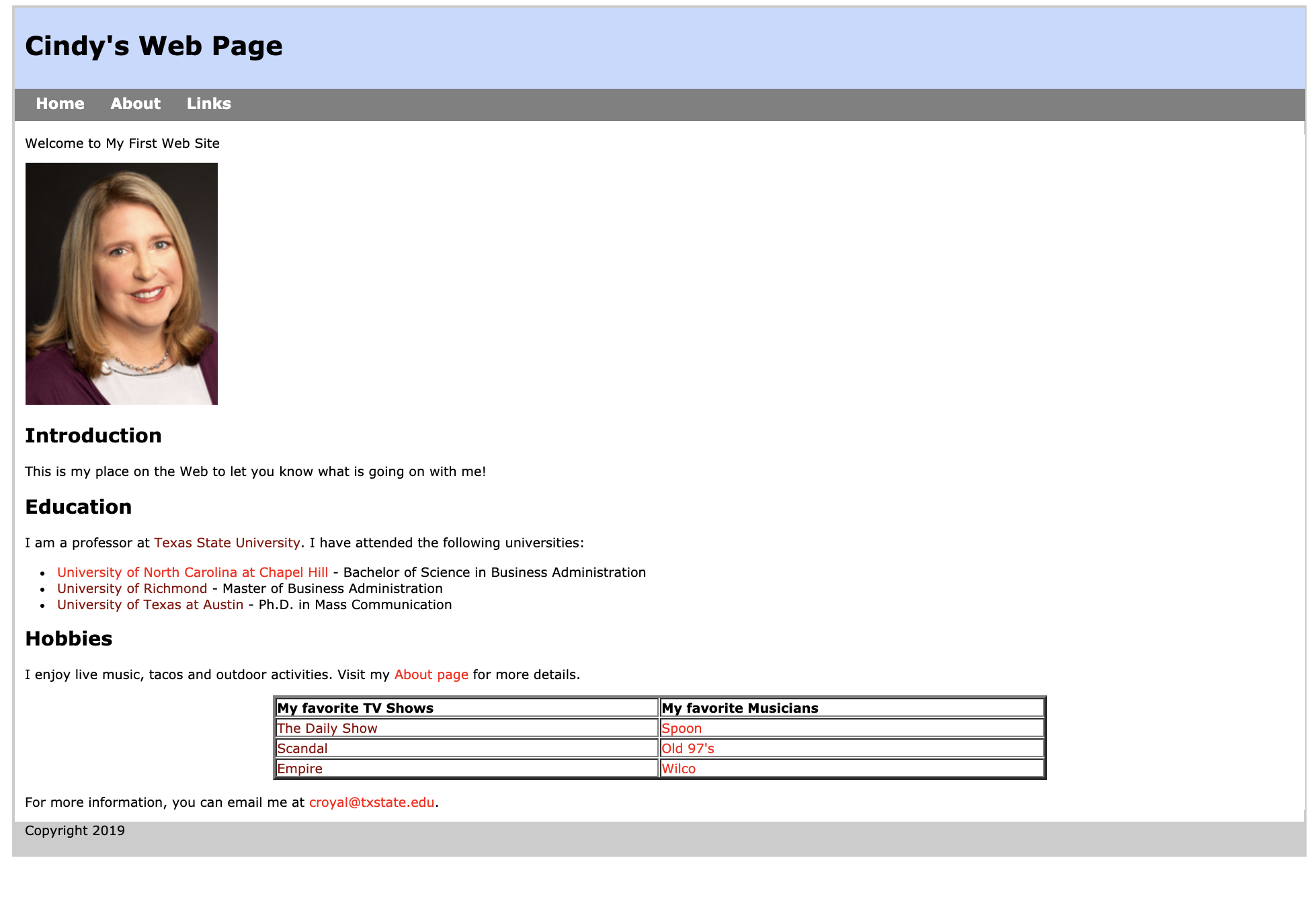
Your page should now look like this. Magic! A completely new layout!
Other Elements
CSS3 introduced some exciting features including non-standard fonts, text effects, gradients, opacity, rounded corners, border images, table striping, multiple backgrounds and improvements in page layout. Here are a few you can try out:
Applies rounded corners to an element:
Applies gradient background to an element:
For CSS comments, use the "/*" and "*/" to surround any comments in a CSS page.
There are some new ways to do positioning with HTML. They are for commonly used elements that can be used without a div for these main sections of the page. It's not required to use these semantic elements, but these are often the standard used in designing sites . You still have to create divs for other segments of the page. Some designers continue to use divs for all their container elements.
Notice that these semantic elements don't use the hashtag or period. They are used as regular html elements.
Add CSS properties as you would for divs in stylesheet, i.e:
Moving On
That's a pretty good introduction to CSS. You should now have an understanding of the basic properties and values and how to use them to design and layout a web page. You'll have to spend some time to achieve exactly the layout and design you want, but you now have a basic understanding of the CSS properties that you need to use. We'll continue to use CSS as we move into Responsive Design next.