
Interactive Charting Exercise
What is it?
We're going to take many of the things you've learned so far in HTML, CSS and JavaScript and apply them to an advanced, comprehensive exercise.
Why should I learn it?
This exercise takes your understanding of JavaScript to the next level. It integrates everything you have learned so far. It will allow you to get more practice with these techniques and begin to customize and develop your own projects.
What can I do with it?
You'll be creating an interactive chart with code. The chart will use data in a JSON format and will be able to be controlled by users.
How long will it take?
You've already been introduced to all these techniques. This exercise will take a few hours to go through, but you'll need more practice to absorb all the techniques and learn how to use them in your own projects.
Getting Started
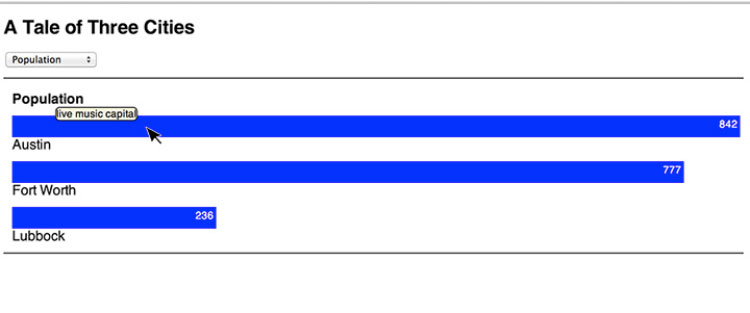
With this exercise, you will learn to use techniques you now know in HTML, CSS, JavaScript to create an interactive chart. When you are finished you will have a chart that looks like the image below, with animated bars, tooltips and dropdown to select different measures. A working example of the chart is below, at the end of the exercise.
We’ll be working with census data comparing cities in Texas, but you can feel free to substitute data of your own.
Setting Up a Basic Chart
Let’s start with a basic bar chart. We will use a div to create a bar on the page. A div, when filled with color, is nothing more than a rectangle. We can use the getElementById method to manipulate the width of the divs.
See the code to the right. Create a basic html page with the proper structure and include a div with the id "bar0" and a class of "bars". We will be putting CSS in the head tag within the style section, but you could also use an external stylesheet if you needed to use these styles across multiple pages.
Include the style information for boxes to create a blue box that has a width of 300px and height 25px. Then add a div below with the name of the first city in it. Use an id of "name0". Note that we are using "0" to correspond to the beginning array index of "0".
The second block of code adds a couple additional bars for cities to the chart. Refresh your page, and you should see something like this:
Code Sample - Setting Up a Bar
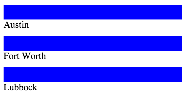
Save the document with a .html extension (any name you want) and open in a browser. You should see the blue bar labeled with “Austin”.
Let’s go ahead and create two more divs for two additional cities, so that the html in the
section looks like this:Add Some CSS
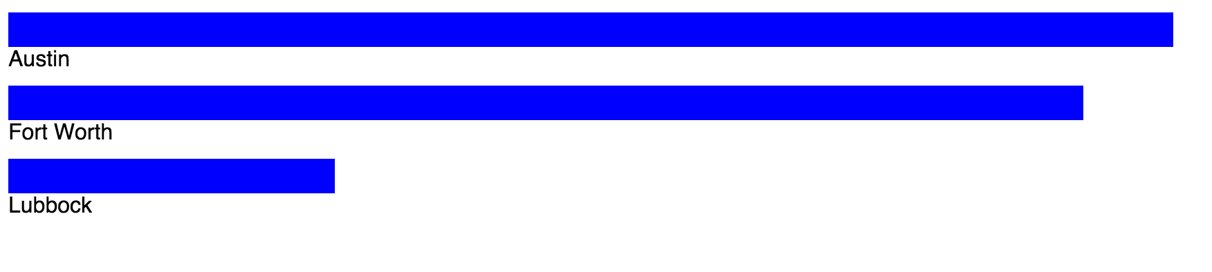
If you open this page in a browser, you will see three blue bars, all the same size, each labeled with a different city. But the fact that they are the same size means that we need to identify them separately by id to adjust the width. Add the code to the right to the style section to correspond to the ids for each div.
You have a bar chart with data! We could stop right here, publish this on the Web. You could add some additional styles to control the font choice, margins or headings. For now, let’s just add a
style that sets the font to Helvetica and size to 16. See the code in the second block to the right.We are using population data from the US Census (quickfacts.census.gov). Let’s assume that a pixel represents 1000 people, although we can make this anything we want. You can modify this depending on the data with which you are working. You should add comment lines to your page that provide any information the user needs to understand the data.
When you refresh the page, you should see something like this:
Code Sample - Add Some CSS
Your CSS should look like this:Adding Numbers to the Bar
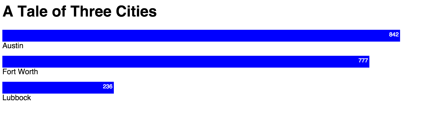
What’s the next thing our chart needs? It would be good to have the actual numbers on the chart. Let’s get them at the end of each bar. Inside each div, let’s add a paragraph that holds the number, using the class “number”. We are using a class for these styles, because we want all three to be styled the same way. See the code in the first block to the right.
Great. You have your data on the bar, but we need to style it now so that it shows up nicely and to the right. Let’s add a style for the “number” class. Grab the CSS in the second block to the right to style the numbers to the right and change the color of the text to while, so it can show up better on the blue bar.
Pretty nice chart. We have three cities, representing population on separate bars. You can add any headings you want to the chart to help the user better understand what is happening. And, you can add any content below the chart. Let’s just add an h1 that tells what the chart is about. Add this above the divs. Create an h1 style to be the size you wish (See the third code block to the right.
Your page should look something like this when you refresh it in the browser:
Code Sample - Adding the Numbers
Code Sample - Styling the Numbers
Add a heading for the chart.
Adding Data with JSON
This chart is awesome, but it’s kind of a pain to have to put the data right into the html and css. Let’s put the data into a JSON section and then use JavaScript to pull it in where it is needed. JSON data consists of objects inside an array that hold the information we want to plot. The objects are key/value pairs to represent city and population. We did this in the JavaScript introduction. Put the JSON data in a script section under the html but before the closing body tag. It is important to put this script below most of the html, because it needs to render after those elements. See the code in the block to the right.
We now need to add the ids id="bartext0", id="bartext1", id="bartext2" to each paragraph that holds the population number. Add to each paragraph as in the code sample in the block to the right. We are using ids here, because we will use each once and this will allow us to use the getElementById method to manipulate the text. And, we should remove the original city names and numbers that we placed in the divs. These are no longer necessary.
Now we will test the magic of the getElementById method. We’ll do the first element in the JSON data, and then we will create a loop to read all the elements.
The getElementById method combined with the innerHTML property allows you to change what is in the html based on the id. The code below changes the innerHTML for “name0” and “bar0” to reflect the first element ([0]) in the JSON data. The second line adds the text to the “bartext0” id. And the third line uses the style.width method to adjust the size of the bar. See the code in the 2nd block to the right.
We could do this for all three bars, but it’s more efficient and more fun to use a loop to read in the data to each item. Modify this section by adding the for loop statement and the accessor variable i. See the loop code in the 3rd code sample to the right.
Since we are using the JSON data to establish the width, we no longer need the styles for each box. You can delete those styles, unless you want to do something unique to each bar later, like give each a separate color. You can also remove the numbers we originally put in the html.
Now you can modify the data in the JSON section to anything you want and be able to use this code to chart anything!
Code Sample - Adding JSON Data
Code Sample - Adding IDs for the Numbers
Code Sample - Reading Data from JSON
This reads the JSON for the first object in the data, the data for Austin. Austin is at index "0" in the array. This example takes the value, divides it by 10 to be able to use percent widths, to make the page responsive. This assumption can be changed depending on the scale of data you are plotting.
Code Sample - Looping Through JSON
Replace the code above with the loop. Goes through the entire array of JSON data, and reads it into each variable, as long as there is data. This saves time, so you don't ahve to do it for each city.
Adding a Dropdown
So, this is an awesome chart showing the city's population. What if we had other data we'd like to show for each city, but we didn't want to create an entirely new chart for each piece of data. Let’s add some additional data about the cities so we can use a dropdown to change the measure we are viewing.
Put the code in the block to the right before the divs that create the chart so it will appear above it. This creates a form with a dropdown that allows the user to change the measure of the chart. We will be creating the selMeasure function next, that will execute when the onChange event occurs on the dropdown.
Code Sample - Adding the Dropdown
Additional Data
Change your JSON data to include a couple other measures, like units and households, all from the census data. See the sample JSON data to the right.
Changing the Measure
We will write a function that will be called in the html form for the dropdown. This function will read the selection in the dropdown.
The function reads the current value in the form and compares it to the items in the array. Then it generates the chart. Notice that each item now has an additional line to display a heading to identify the measure. This changes depending on the variable “m” which is equal to the item selected in the form.
Code Sample - Additional Data
To show the title for the measure, include this in the html below the dropdown form:
selMeasure() Function
We create the initial view of the chart, which is exactly the loop we had above, with the addition of the heading for the category. This is what the user will see before anything is selected in the dropdown.
This function switches the JSON data into the chart, based on which measure was selected. Note that you only have to write the city name once, since that is the same for all three measures. Each part of the if statement handles the changing measure (Population, Households, Housing Units). Then it displays the measure using the "cat" id and executes the for loop to display the appropriate data.
Code Sample - Initial View of the Chart
Code Sample - Writing the Function
Optimizing the Function
Much of this is redundant. Let's write a function the gets called each time it is needed.
Let's create an array to hold the Measures. The Object.keys function chooses all the key names in the data (Population, Units, Households). Since it is the same for each item, we just need it for index 0. Then we will access them with the array number for each measure. This is a great way to do it, because it relies on exactly what is in the data set. Put the code to the right in the script below the JSON section.
Then let’s put the script in a function, so we can use it for each Measure that is selected. We give the writeData function an argument that will change depending on the form submission. We write the function for the initial view.
We can improve the code now by writing the writeData(x) function once and using the selMeasure() function when called by the form submission to change the argument. Much shorter and simpler!
Code Sample - Add an Array for the Measures
Code Sample - writeData(x) function
Code Sample - Improved selMeasure() Function
Some Additional Effects
Adding a Border Around the Chart
Include a div id="main" around the chart starting below the dropdown form. Remember to close that div at the end of the chart content. Then include a style to create some border lines at the top and bottom.
Animate the Bars
We can add a simple animated effect to jazz up the chart a little. Let’s add a CSS3 transition to draw the bars.
Add the last line to the .bars class. When you switch measures with the dropown, you will see a drawing effect on the width. Chrome supports this effect without having to use the browser prefix. For browsers that don’t support this feature, the user will not see the animated effect.
Code Sample - Adding a Border
Code Sample - Animation
Since we are using a current version of Chrome to test the transition effect, we simply used the transition style. It's a CSS feature, and not fully supported by all browsers. To use in production, it is best to include the prefixes for full browser support, i.e.:
Adding a Tooltip
We are going to use a little JQuery to add a tooltip to each bar. Notice that we already have a tip in our JSON for each city.
JQuery is a library that provides a variety of JavaScript functionality. The JQuery UI takes that a step further by providing specific User Interface functionality. You can learn more here:
- JQuery - jquery.com
- JQueryUI – jqueryui.com
Note also that we added this line to the writeData() function to handle the tip. Since the tooltip is the same for each measure, we only have to establish it once.
To add the tooltip, we just have to add a short function and modify the loop to write the tip.
First, we need to include the link to the JQuery UI library. You can link to it online or download it to your own server. Put this in the head of the document.
Next, we need to include the Tooltip code in a function. Put this within the script tag at the bottom of the page. The first line is the way that all JQuery functions are started.
We need to do some styling with the tooltip as well. Play around with the CSS to get it to look the way you want.
If you don’t like the position of the tooltip, you can add the offset within the function to move around the left and top position, like this.:
Finished Product
Take a look at a working example of our chart as it appears now. Change the category with the dropdown to see the data change and the animated effect.Code Sample - Finished Product
Moving On
That's a pretty comprehensive exercise! Think about all you have done to get to this point! Now, let's move on to some additional interactive examples and functionality with JQuery.